
Advanced digital learning
The development of the Advanced Digital Learning brand was a deeply collaborative and technically demanding endeavor, shaped by years of rigorous research and innovation within the product development organization.
As Creative Lead, I was tasked with translating a complex ecosystem of educational technologies—rooted in cognitive science, adaptive learning algorithms, and data-driven instruction—into a brand identity that was both accessible and aspirational.
The challenge was to distill intricate technical concepts into a visual and verbal language that could resonate with diverse audiences, from institutional stakeholders to individual learners, without compromising the sophistication of the underlying technology.
View some elements of the brand below, or see the full set of Brand Guidelines HERE.

The Logo
The logo illustrates data points moving forward and molding into an American eagle profile. The blue to purple gradient also indicates forward motion as it’s always placed at a 45 degree upward angle.
The ADL logo was built to function within a plethora of constraints. It must read as a Department of Defense organization, but also communicate that ADL is different than many organizations under the DoD umbrella. It has to communicate the technological advancement and forward thinking driving Advanced Digital Learning, and be usable in a wide variety of media from Favicons to Conference banners. It has to transform into a DoD badge for official government documents, and look good on a Dashboard for service members.

The Badge
All DoD organizations must have a badge. Think Nasa’s iconic blue sphere with starry background and red swoop. ADL’s aim was to have a similarly-recognizable badge for government use. The badge design blends seamlessly with the futuristic and forward-thinking ADL brand package while clearly marking ADL as a government organization.

Sizing Considerations
Because of the complexity required in a DoD emblem or badge, an alternate ‘tiny’ badge was required. When used at a size less than 144px square, such as an app icon or favicon… when DoD branding practices require the use of a badge over the logo or logotype, the alternate ‘tiny’ badge should be used.
The tiny badge has less detail; eliminating the data network in the background of the full-size graphic. Type sizing and graphic spacing has been altered to function in small-scale applications.
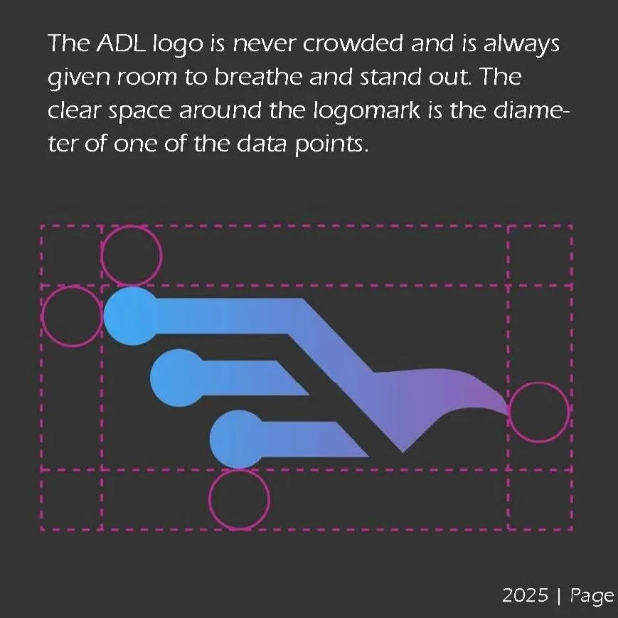
Attention to Detail
The ADL mission is all in the details… and so is its branding. The brand guidelines lay out specific sizing considerations, detailed reasoning behind color choice and gradient usage, and more.
Stakeholders, government leads, and users of ADL products sense the organization’s intention and intensity based on the seamless, beautiful and engaging visual packaging the brand identity provides.