
1
2
3
4
5
6
7
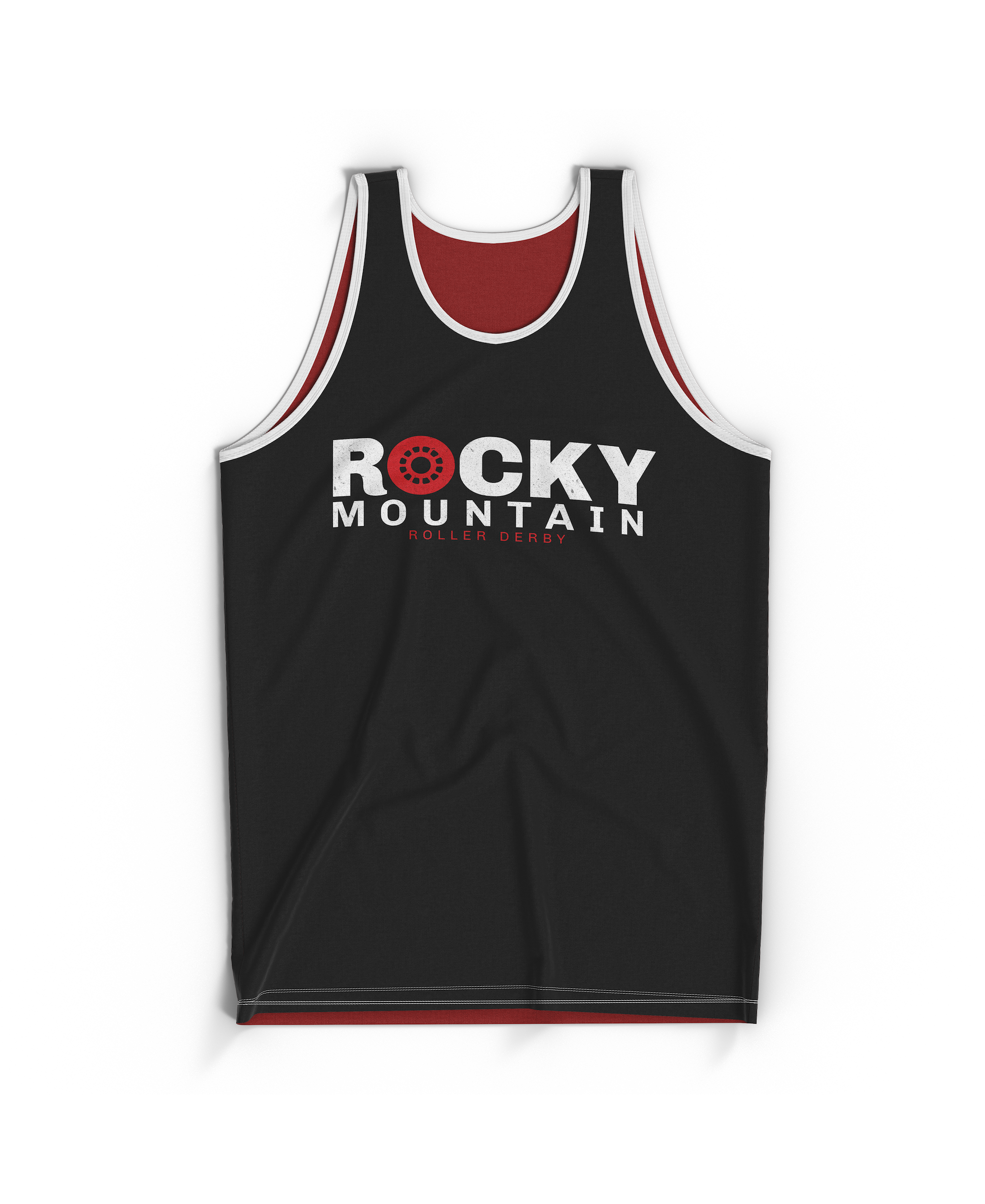
The Board of Directors put out a call for a new logo to re-brand the league from “Rocky Mountain Rollergirls” to “Rocky Mountain Roller Derby.” The call asked that the branding be gender-neutral, to use the same brand colors that Rocky started with, and suggested that mountain imagery be incorporated.
This branding package won the league vote by a landslide, with 95% of league members voting for its implementation.
The grungey textures and committment to the historic Rocky color palette bring through the rough-and-tumble feel that is Roller Derby. The polished shapes and bold graphics bring a higher-level take-us-seriously vibe that elevated this 20-year-old brand to feel competition-ready and open to all skaters.
The main intent of this re-brand was to swap the hyper-sexualized logo and gendered name the league started with for an inclusive and forward-rolling look and feel.
Check out the logo designs and some jersey mockups below.